Tuesday, November 29, 2011

Update on the "Crummy to cute" house

The house is finished!  The carpet and tile is in, cabinets hung, all appliances (except the stove) hooked up and ready to go!

For a reminder on the before of this house, head over here: Nasty, nasty house!

I don't think I've seen a house in that bad of condition before.  It was really awful.  I can't claim to have helped with anything else other than what you've seen before, but my brother and cousin did a great job finishing it up, and I can't help but show it off for them.


Starting from the back porch/utility room:


Leading into the kitchen: 


Which sends you to, the restroom (no, I don't want a bathroom right outside of my kitchen either, but this is a rental...let's not be TOO picky!):


From there, you can see the hallway:


The hallway leads to the living room:


And, of course, the three bedrooms:


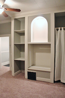
Hellooooo, huge closet!

Bedroom 2

Bedroom 3


The house is available for rent now, and once it starts getting really cold out, and his business dies down for the year, my brother will be redoing the exterior of the house.  I think it turned out great.  Really great.  Completely amazing to have been there and seen (and SMELLED) the before of this house, to see how it is now.


Stay tuned.  Soon I'm going to give you my take on Miss Mustard Seed's (and Liz's from The Midwest Cottage) famous paper ornaments, and wreaths-- perfect for the Holiday season!


Tuesday, November 22, 2011

Let's talk: Antibes Green

Last week, I finally ended a battle that had been ongoing for far too long.  Before I opened my booth, I had picked up a cute little dresser with my brother on our way to a haunted house in St. Louis.  It was very plain with just a design nicely painted on one drawer, and had sweet little chunky feet.


I thought it would be fun to do it in a bright, fun color.  I pulled out my brand new can of Antibes green and got to work.


Two coats later, I had what I referred to as Frankenstein (it was Halloween...seriously, that long ago).  That thing was GREEN.  Lime green.  Blinding.  I'd read a lot about how dark wax can really tone it down, so I distressed it and went over it with clear, and then a pretty heavy coat of dark wax.  I had envisioned it coming out like the example piece on Annie Sloan's website.


It didn't.  The dark wax started dragging (which you must know is impossible to fix once it's happened...touch ups fix that area but make the surrounding ones darker, so it's still noticeable, and just looks dirty).  I painted over the areas that dragged with green, again...and tried, again.  It didn't work, again.  So I mixed some Paris grey with a little green because I REALLY wanted this darn dresser to be green, but not GREEN.  I painted it, and hated it too.  Augh.

At this point, I was ready to throw the thing in the ally.  Ever have one of those?  I was so mad at it, and the amount of this expensive paint and wax I had wasted on it!  I decided it must not want to be any shade of green, so I pulled out my old white, slapped two coats on, and distressed it.


And then the green wasn't so bad, because where I distressed, this little bit of green peeked through like a happy surprise on a plain canvas.


So, I thought I'd give Antibes green another shot...on a smaller piece.  You know, maybe I had just been doing something really wrong?  I picked up a little half moon table that had been painted hunter green with flowers all over it's top as the candidate. I stripped and stained the top, and painted the bottom and did the same clear and dark wax as on the dresser.  My thinking was that with a smaller area, the green wouldn't be so overwhelming.


Well, it still is.  It turned out okay, but it's still pretty in-your-face intense, and not really my cup of tea, but I could see it sitting on someone's front porch nestled between two chairs.  I think I would like it if it were more apple colored than lime.  If I had more colors, I'm sure I could mix it to get it where I like, but I don't honestly think I'll order Antibes again.  

What are your thoughts on the color?  Have you used it on a piece and hated it?  Loved it?  My google search turned out pretty limited examples of pieces painted with it, so if you've done something in Antibes I want to see it!


See you soon,


Sharing at:
Savy Southern Style
Domestically Speaking
Miss Mustard Seed's Furniture Feature Friday

Tuesday, November 8, 2011

My booth

Wow, ladies.  You've really been making my week.  Almost 40 new followers, and 40 some comments for my Fat Bottomed Girl.  You really know how to make a girl smile.

That being said, I have to apologize for such a huge lull in posts.  This last week I moved into my little booth at Lisa's II Antique Mall.  I have also been busy working on new pieces, hosting a baby shower, making cupcakes, cakes, and cake pops.

Quickly, before I get into the meat and potatoes of the post, I'll show you the quick before and after of the bedroom outfit you'll see below.

(okay, so I already did the top here...just play along! And imagine the bed's in with it.  You get the gist.)


Yay, huh?  I like it.  It's a 1/2 and 1/2 mixture of old white and Paris grey, clear, and dark wax all over.  I left the imperfections, and love how they grabbed the dark wax.  The dresser was missing a knob on the top, so I replaced them all with clear glass ones.  I'm sharing the dresser at Miss Mustard Seed's party...

Furniture Feature Fridays


OKAY- now the real point of this post...  My booth.  #17.  Kind of perfect that I was randomly assigned that number, since I was born on the 17th.


I'm on a corner in the upper level.  I'd prefer to be on the lower level, but since I must be on the upper one, my spot is great for two reasons.  First, I'm literally diagonal from the elevator, which is a big help since I have furniture.  Second, it's right at the top of the stairs, so it gets a good amount of attention.


Now, the downfall.  I think you can see the major one.  I don't have a wall.  I have a half wall, which means that my booth looks cluttered because you can see all the other booths that are (in my opinion) a bit over crowded and sometimes unfocused.  The divider that I share with the booth on my right is an eyesore and needs to be covered.  I have a tiny section of outdated looking peg board, and still don't have any hooks to hang anything on them.  The two frames hanging there are only there b/c they have wires that I could loop around the back of the hooks sticking through from the other side. I can't hang anything from the ceiling.


I'm really excited to have this space though, and I'm going to make it a cute and functional.  This weekend is the Holiday open house, and I really want to have more up in the way of dividers, and be able to tote down a few more larger pieces before then.  I'm planning to hang a drop cloth curtain along my divider wall, hang some burlap to cover the outdated peg board, put some doors in the open corner to section it off....but I really can't think of what to do on my half wall to hide the booth behind it.


Thoughts?


More soon.  For now, I'm off to paint.